Tag Archives: usability

Usability of websites on mobile devices

Jakob Nielsen has been undertaking some usability testing of websites using mobile devices.

His conclusion:

In user testing, website use on mobile devices got very low scores, especially when users accessed “full” sites that weren’t designed for mobile.

Doesn’t surprise me. Websites are usually designed by designers and often they focus on how it looks then how it works. This is bad enough when using a browser on a computer, but when it comes a mobile device as Jakob’s study shows, it doesn’t work well or doesn’t work at all.

The number of mobile devices is increasing and the amount of mobile web usage is going up as well. Designers of websites and e-learning content need to consider mobile devices now rather than wait until it is too late.

iPhone

e-Learning Stuff Podcast #008 – Forcing the windows open!

e-Learning Stuff Podcast #008 - Forcing the windows open!

This is the eighth e-Learning Stuff Podcast, Forcing the windows open!

[audio:http://elearningstuff.files.wordpress.com/2008/11/elearningstuff008.mp3]

Download the podcast in mp3 format: Forcing the windows open!

Subscribe to the podcast in iTunes.

In this show, James is joined by Nick Jeans, Kev Hickey, Dave Foord and David Sugden.

In this the eighth episode of e-Learning Stuff they discuss the pros and cons of forcing links to open in new browser windows. In that discussion they cover accessibility, usability, links, legal implications, frames and then some…

Shownotes

Photo source.

“A bad workman always blames his tools”

A bad workman always blames his tools.

Proverb

Over on Learning with ‘e’s Steve Wheeler is talking about VLEs. He says

OK, this is my opinion, but many VLEs are not fit for purpose, and masquerade as solutions for the management of online learning.

He continues…

I have not seen a single VLE system yet that works so transparently that students think more about their learning than they do about how to make the damn VLE work. Again, I don’t blame this on the users – it’s a management and design issue.

Though I wonder is it just a management and design issue?

I don’t disagree with him entirely, as many VLEs are badly designed and usability often leaves a lot to be desired. Functionality can often be complex to set up and use. However this is often the case with a lot of online tools and services.

So what’s the alternative?

Don’t compare VLEs with the way you want it to be compare it to not having a VLE.

Think of a VLE as a journey rather than a destination for online learning.

I look at the way our learners use the VLE to enhance and enrich their learning. Is it perfect? Of course not! Could it be better? Yes! Are they fit for purpose, well depends on who designs that purpose, but no they’re probably not. Are they getting there? Maybe!

However compared to the situation five years ago when we didn’t have a VLE, it has enhanced the learning experience of our learners.

Using a VLE does not preclude you using other web based tools, it can be the cayalyst. With RSS it is possible to use the VLE as a focus for other web based services.

The problem with VLEs is that often it is not just the VLE which is the problem.

The VLE is ONLY a tool.

Even with a blunt chisel it is possible to create a beautiful sculpture.

A bad workman always blames his tools

In teaching, you can create learning without a classroom, you can be outside on the grass, in a coffee shop. The environment is only one part of the experience; is it the most important part? I think not.

When learners and teachers complain about the VLE, are they genuine complaints about usability and functionality? Or are they just excuses for not using a tool as they don’t want to use it or learn how to use it.

If we just use VLEs as a repository of materials, why is that the fault of the VLE, isn’t that more of an indicator of how most people teach? Lectures with handouts are the physical manifestation of the virtual repository.

If web tools are so fantastic and so much better than VLEs, why isn’t everyone using them all the time?

The problem is that it is easy to focus on the problems with the tools we use and harder to focus on the problems with the people who need to use these tools.

Photo source.

Forcing windows open

Here’s a question?

When you design a website with external links, add links to your VLE, do you force the link to open in a new window or in the same browser window?

For me forcing new browser windows open on the user is both poor practice and annoying for the end user.

Rather than do that use the following text next to any link.

To open link in a new window right or ctrl click and click Open in a New Window

Forcing new windows breaks all web usability guidelines and creates problems for users and importantly affects accessibility issues. International user accessibility guidelines recommend against the “new
window” approach.

When a new window opens in front of the old one a novice user is likely to think that the “back” button associated with the new window will take them back where they were before, and doesn’t know what to do when it won’t, this can be just as annoying as closing the whole window.

Confident users can cope with the forced new window, new users can not.

Similarly a disabled learner, using a head pointer or other assistance device, won’t be able to simply click on the back button to return if the code has forced a new window to open.

This could be a significant problem for many learners suffering from quadraplegia, other disabilities or visually impaired learners.

Also Firefox has an option which actually stops new windows from happening.
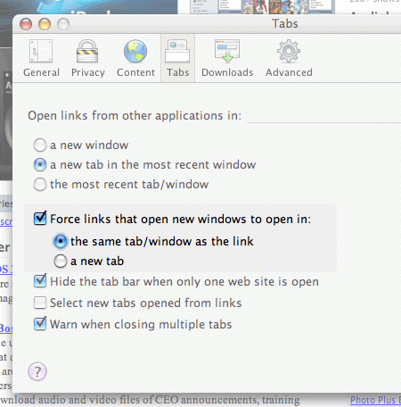
Forcing windows open

Other sources on why you should never force new windows on users.

Check point #2 on Jakob Nielsen’s usability website.

Opening up new browser windows is like a vacuum cleaner sales person who starts a visit by emptying an ash tray on the customer’s carpet. Don’t pollute my screen with any more windows, thanks  particularly since current operating systems have miserable window management). If I want a new window, I will open it myself!

Designers open new browser windows on the theory that it keeps users on their site. But even disregarding the user-hostile message implied in taking over the user’s machine, the strategy is self-defeating since it disables the Back button which is the normal way users return to previous sites. Users often don’t notice that a new window has opened, especially if they are using a small monitor where the windows are maximized to fill up the screen. So a user who tries to return to the
origin will be confused by a grayed out Back button.

Another view from Sitepoint.

Here are the top 5 reasons why you should beware of opening links in a new window:

Unless you warn them, Web users are likely to expect the new page to load in the current window. Unexpected surprises can be fun, but not when you’re browsing the Web.

The act of opening a new browser window resets the back button in that window. The back button is the second most used navigation function (after hyperlinks, source: useit.com), so resetting it is a big no-no.

To open a new browser window can disorient very novice Web users and the visually impaired. They might not realise that a new window has opened and might struggle to switch between windows.

Opening a new browser window disrespects the desires of your users. If they want a new window, they’ll ask for one. Don’t force a new window upon users unless there’s a very good reason to do so.

New browser windows can make an already cluttered taskbar even more difficult to use. We’ve all spent ages hunting through the taskbar in search of the window we want. Don’t make this process even harder by increasing the number of windows the user has open.

Do you have a view?